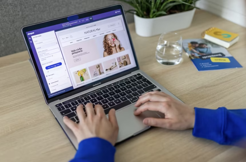
For a startup, your website isn’t just a digital business card; it’s the most powerful tool you have for growth. A good site can turn casual visitors into loyal customers, but a poorly designed one can send them running in seconds. The trick to making your website work for you is designing it for conversions, which means getting users to take the specific actions you want. This guide will show you how to build a website that not only looks great but also actively helps your startup succeed.
First Impressions Matter Online
You only have a few moments to grab a visitor’s attention and show them you’re credible. Studies show people form an opinion about your website in about 50 milliseconds, and that first impression is mostly about the design. A messy, old-fashioned, or confusing layout can immediately make you seem unprofessional and untrustworthy, causing potential customers to leave before they even see what you offer.
A clean, modern design is the starting point for a good first impression. It tells people your company is up-to-date, professional, and cares about their experience. This is especially true when you build on a reliable platform. WordPress Web Design services help create a website that’s visually appealing, easy to navigate, and built to support your business goals from the very first click.
Understanding User Experience (UX)
User experience (UX) is all about how a person feels when they use your website. Good UX means your site is easy to use, makes sense to navigate, and is enjoyable to browse. For a startup, focusing on UX isn’t a luxury; it’s crucial for guiding visitors toward your conversion goals. If users get frustrated trying to find information or finish a task, they’ll just give up.
Three key parts of strong UX are:
- Easy Navigation: Menus and links should be clearly labeled and organized logically. Users should be able to find what they need within a few clicks.
- Mobile-Friendly: Your website needs to look and work perfectly on every device, from desktops to smartphones. Since search engines prioritize mobile-first indexing for websites, a site that doesn’t adapt to mobile can hurt your visibility and annoy most users.
- Quick Loading: Slow pages are a big reason people leave a site quickly. Optimize images, simplify your code, and pick a reliable hosting provider to make sure your site loads fast.
Designing for Conversion Goals
Every page on your website should have a purpose. Before you even think about colors or fonts, you need to decide what a “conversion” means for your business. Is it buying a product? Signing up for a newsletter? Requesting a demo? Once you know your main goals, you can design each page to guide users toward that specific action.
Use visual hierarchy to draw attention to the most important things. This means using size, color, and placement to create a path for the user’s eyes to follow. Your most important call-to-action (CTA) button should stand out, not blend into the background. For example, a “Get Started Free” button should be more noticeable than a link to your “About Us” page. By designing with a clear goal in mind, you turn your website from a passive information hub into an active tool for getting customers.
Key Elements of a High-Converting Site
While the overall design is super important, some specific elements consistently help increase conversion rates. Adding these to your site can make a big difference in turning visitors into leads and customers.
- Clear Calls-to-Action (CTAs): Use action-oriented words that tell users exactly what to do (e.g., “Download the Guide,” “Shop Now,” “Book a Consultation”). Make your CTA buttons bold and easy to spot.
- High-Quality Visuals: Professional photos and videos that show off your product or service build trust and help visitors imagine the value you offer. Try to avoid generic stock photos whenever you can.
- Social Proof: People trust other people. Showing testimonials, customer reviews, case studies, or logos of companies you’ve worked with can really boost your credibility. The effect of social proof on conversions is well-known, as it gives outside validation for what you claim.
- Simple Forms: When you ask for user information, only ask for what you absolutely need. A long, complicated form is a major turn-off. For a newsletter signup, an email address is often enough.
Testing and Iterating for Success
Launching your website is just the start. The most successful startups treat their websites as ongoing projects that need constant improvement. The only way to truly know what works is to test different approaches and look at the data.
A/B testing is a powerful way to do this. It involves making two versions of a page (Version A and Version B) with just one thing changed, like the headline, button color, or an image. You then show each version to a part of your audience to see which one performs better. This data-driven method removes guesswork and lets you make small changes that add up to big gains in conversions over time. Start small by testing your main CTA or headline and go from there.
Ultimately, a website that converts puts the user first. By focusing on a clean design, an easy experience, and clear goals, you can build a powerful asset that helps your startup grow for years to come.